Native HTML5 Modals (aka HTML Dialogs) are FUN!
Yeaaa!!! You heard me right native HTML5 Modals are finally here, available across all evergreen browsers and they are fun. Well actually its the new <dialog> element. While it does require a bit of javascript to work for events and the likes, most of the functionality you need to create a modals come out of the box white this gem.
Creating a modals with the dialog element is pretty simple compared to what we had to do before to get a modal on the page, I will walk you through the my process to try and give you an idea of how simple it can be.
Creating a Modal Dialog
The
<dialog>HTML element represents a dialog box or other interactive component, such as a dismissible alert, inspector, or subwindow.
THE HTML
The HTML5 dialog is just and empty container and comes hidden by default you can make it visible by adding the open attribute to the element and styling the element and content. The beauty of this is that it provides a blank canvas for you to work with unlike some of the other HTML elements that requires you to hide the default appearance to customize.
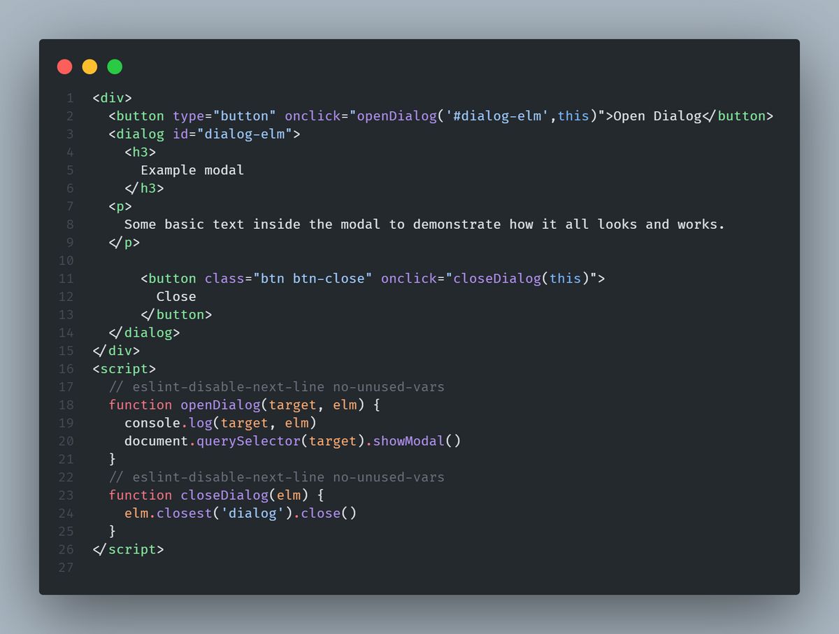
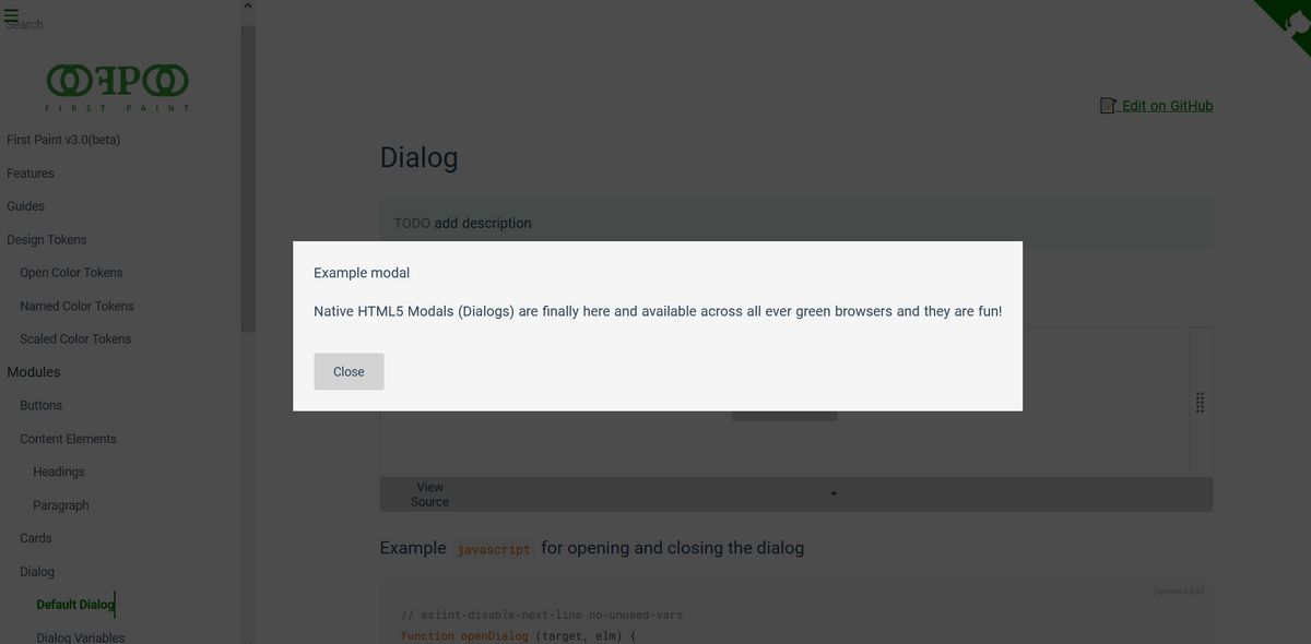
Here is very simple (HTML) example - just a heading some text with a button to open and close the modal. Check out a code pen demo here
<div>
  <button type="button" onclick="openDialog('#dialog-elm',this)">
    Open Dialog
  </button>
  <dialog id="dialog-elm">
    <h3>Example modal</h3>

    <p>
      Native HTML5 Modals (Dialogs) are finally here and available across all
      ever green browsers and they are fun!
    </p>
    <button class="btn btn-close" onclick="closeDialog(this)">Close</button>
  </dialog>
</div>
THE JAVASCRIPT
The javascript used is this example demonstrates the dialog.open() and dialog.close() methods. You also have access to dialog.show(), dialog.hide() and dialog.destroy() methods to extend the native element.
 function openDialog(target, elm) {
    console.log(target, elm)
    document.querySelector(target).showModal()
  }
  function closeDialog(elm) {
    elm.closest('dialog').close()
  }
THE CSS
This is where I had the most fun, I used CSS props to make styling the Dialog dynamic, added ::backdrop pseudo-element that allows you to style the background of the dialog with minimal effort. Additionally you can tap into the [open] attribute to style the dialog.
The
::backdropCSS pseudo-element is a box the size of the viewport which is rendered immediately beneath any element being presented in fullscreen mode. This includes both elements which have been placed in fullscreen mode using the Fullscreen API and
dialog {
    --diag-bg: whitesmoke;
    --diag-bg-img: none;
    --diag-cl: inherit;
    --diag-x: 1.5rem;
    --diag-y: 1.5rem;
    --bk-drop: rgba(0, 0, 0, 0.5);

    background-color: var(--diag-bg);
    color: var(--diag-cl);
    background-image: var(--diag-bg-img);
    padding-inline: var(--diag-x);
    padding-block: var(--diag-y);
  }
  dialog::backdrop {
    --bk-drop: rgba(0, 0, 0, 0.5);
    background-color: var(--bk-drop);
  }
Accessibility
The dialog element still has compatibility issues with some forms of assistive technology, which may prevent people from reading or using dialog element content.
While, I have not done any meaningful research into the details of making the dialog element accessible, I would add the aria-live to the element to make it announce changes with aria-modal and aria-hidden attributes. A listener for the esc key to close the dialog, and tab focus for keyboard navigation. Check the here for more info and examples.
Links and References
Cordorps - How to implement and style the dialog element
Mark Dotto - Fun with the dialog element